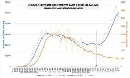
I think this chart is really interesting:
(Credit for the chart.)
You can see that at the start of the epidemic, deaths were lagging behind cases by 6 days. But now it’s been a month-and-a-half since the two curves diverged. Cases have been soaring for about a month, while deaths have continued their steady decline.
The rejoinder is often “wait two weeks and deaths will rise.” But the chart shows that we’ve already waited more than four weeks, and, if the early pattern prevailed, we should have seen a surge in deaths in only about one.
Some say that the rise in cases is merely more testing. I don’t think that explains it (although it might be part of it) since the percentage of tests that were positive started rising at about the same time. My theory is that the people getting sick are younger (and thus less vulnerable) than the ones who were getting sick before.
In any case, I think the chart shows convincingly that although the rise in cases is surely troubling, we can temper our alarm.
UPDATE: The day after I posted this, the death rate started to rise, which obviously is bad. Nevertheless, the point still remains that deaths are not mirroring cases.

You must be logged in to post a comment.